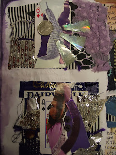
For this project I used many found objects but mainly cards as my theme.I started by creating samples pieces changing the compisitions of different household items on a card.My reasons for making each of these samples was so I could take pictures of each one and edit them in hope of creating a logo for a tshirt or a dress.Originally I was going to make a dress using these cards but after taking the pictures swerved the idea as I think my design in the end was a detailed high quality design and perfect for a logo that could be used today within the industry.My main target audience were alternative teens.
 |
This is a print I did using image maker with my final design .
The print wasnt one of my better ones but I quite like the scruffy textured look it gives off . |
 |
My final design.
This started off as a collage.It was then scanned and edited to give the effect of a 2D flat surface rather than have materials and found objects looking realistic I tried to create more of a surreal effect.
I did about 6 final designs in a variety of colours
This is my favourite of them all which is strange as Im not realy a fan of the colour pink within Artwork |
.......sample pieces.......
 |
I had alot of different samples to choose from when it came to deciding which I wanted to make into a final piece.
I realy loved working with the different objects and materials and found it quite interesting that it was so easy to make a matchstick along with other found objects look good just by composing them in the right way.
It was cheap to make and I think there were many other ideas I came up with that could have had the same effect but a total different turn out. for eg collage work even 3D work or it could have been brought into a textiles piece as alot of sewing was involved within some of the samples. |
 |
| The original background design to my final piece |
 |
| playing around with colours and using printing methods |
 |
| drawing from primary sources |
 |
| This is a print design using the symbols off cards for earlier development within the project |
 |
| earlier development |
 |
| I did alot of printing throughout this project.This is one of the better prints I did but nowhere near as detiled as I wanted using this print method |
 |
| These two prints I did using alot quicker method I learnt in highschool and if im honest I prefer these prints to the ones above using proper printing facilities |
 |
This print I did by using an image that was printed off of one of the choices for a final design.
It was then placed in acrylic paint face down and this was the turn out.
Im not that keen on printing methods but the technique left quite a nice textured finish |


No comments:
Post a Comment